


Wind Direction Maps
| This
an example where the 10 to 13km/hr North wind has abated and
then swung around and blowing directly from the south at 10-13km/hr for
about fourhours, died off to 1-3km/hr, and reversed again to come from
the north at 8-9km/hr. The older information is on the left and the latest information is on the right. Each column is roughly an "hour", each row is a sixteenth of a circle (22.25degrees). The wind direction is now averaged over the last 16 readings whick provides a more consistent indication of the direction for the main header table of the Weather page and also produces tighter graphs of where the wind is coming from as well. The Average Wind Direction is not as easily computed as it might seem so check out how it is done on the "Wind Direction Averaging" page. | 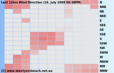 |
| If read in
conjuction with the wind speed below it can be seen where
the speed of the wind dropped to about 1.5km/hr four hours previously.
This drop and rise in
wind speed is also
indicated on the Direction Map by the red bricks fading back towards
light pink on
the white background. Strong red equals strong winds. These charts were chosen as they are good, clear examples of how the wind direction map and wind speed graph can be combined to get an overall view of the previous 12hours of wind activity. | 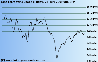 |
If you are interersted in measuring meteorogical events around your home then you should consider making a Ping Pong Ball Anemometer. It is a really neat concept and and can take a lot of the guess work out of estimating wind speed. Now let me see is there an Arduino Ping pong Ball interface?
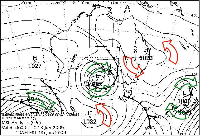
Below is
the BOM synoptic chart for a day early in June. High
pressure zones cause the heated air to rise from low down to
first move upwards then outwards in anti-clockwise spirals,
whereas
the low pressure areas create the opposite, they draw air inwards and
downwards in clockwise spirals. (ie in the Southern
Hemisphere). I
have added some coloured arrows below to highlight these
ideas.
If the weather was so easy to predict then our life would be
so
much easier, however in reality there are so many influences,
and
we are lucky if we get half of it right :-) As we can see from the
information above the wind directions locally can switch around quite
quickly and rarely follow the precise patterns given in a synoptic
chart, hence the usefulness of a local weather station.
Here is a simplistic "side on" diagram of how the rising hot air gets cooled, in the upper atmosphere and falls downwards to the land to be heated again..
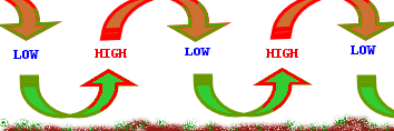
The highs and lows are not physically high or low in height, it is the overall pressure in that general area that is either low or high, regardless of altitude.
Low means cooling, dropping air, and high means rising warm air, and as it moves it spirals!!! Voila, rotations!!!!
Check out their site for a first hand explanation... High and Low Pressure effects.
If you have heard of the East Coast Lows and how they bring rain to far east Gippsland then have a look at this page.